Press

House Beautiful - April 1, 2021 - Hadley Keller
Marie Fuer Creates a Modern Family Apartment With Pops of Color and Tons of Hidden Storage

Form and function, without the clutter.
Marie Fuer's first meeting with a new Brooklyn-based client resulted in instant chemistry: "I met her and I immediately felt I had known her forever," the designer says. "We just really hit it off, and I loved getting to know her and her husband"—an integral step in any successful design project. Better yet, Fuer recalls, the clients weren't averse to bold design choices: "She’s so into color. Lots of clients right now are into the greige—I do a lot of that, and I’m not putting it down, but it’s fun to have a client say ‘I want red, I want yellow!'"
The only problem? Though the Park Slope building where the couple had purchased a new apartment was a landmark, the unit itself, recalls Fuer, “was pretty much a vanilla box. There was no character or style to it."
Luckily, though, the new owners came with some serious ammunition. In addition to the aforementioned love of color, "They have this incredible art collection and a ton of books,” says Fuer. Plus, they already owned a fair amount of mid-century furniture. So, Fuer set about reimagining the home’s finishes, floorplan, and interior architecture—to maximize storage and warm up the palette—then working to cleverly place the family’s beloved items in a fresh new way.
Kitchen
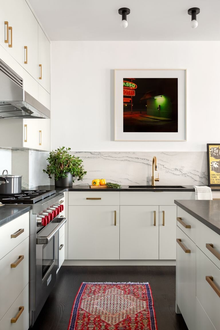
When the family first purchased the apartment, "There was a wall where the kitchen is now, and the existing kitchen was just this little space in the right corner,” recalls Fuer. “They knew they wanted to expand the kitchen and make it the heart of the apartment.”
Doing so without sacrificing storage meant investing in smart custom cabinetry. “In older buildings like this in Brooklyn a lot of times there’s an awkward space, so if you don’t have a custom solution it’s difficult,” the designer explains.
Working with her cabinetmaker, Fuer “looked at all of [the client's] stuff and made compartments for tools, for chef’s knives, for cutlery,” she recalls. She also integrated all the appliances, a splurge that the designer says was well worth it: “Even on lower budget projects, the custom cabinetry just makes such a difference. And it doesn’t have to be over-the-top expensive either! Plus, it’s a good place to put the money for resale value.”
The designer brought in warmth with a veined stone backsplash, dark wood floors, and a vintage rug (repurposed from the family's former home). As for the countertops, she opted for a quartzite with the look of soapstone—but that's much more durable. "It's a really practical option," she says, for families who actually usetheir kitchens.
Dining Room

In contrast with the more layered living space, Fuer kept the dining room airier, letting the silhouette of Patrick Townsend's Orbit chandelier and a print by Lilliana Porter take center stage over the warm wood dining table and Eames dining chairs. "Their old apartment was very midcentury-driven; here we tried to break it up a bit and let the artwork sing," says Fuer. The tall ceilings, white walls, and "ridiculous light" add up to being a perfect backdrop for it.
Primary Bathroom

The parents' bathroom has a more muted palette than their bedroom, with marble counters and gray patterned floors by the Cement Tile Shop setting a tone of quiet luxury—and complementing the framed print by Kiki Smith.
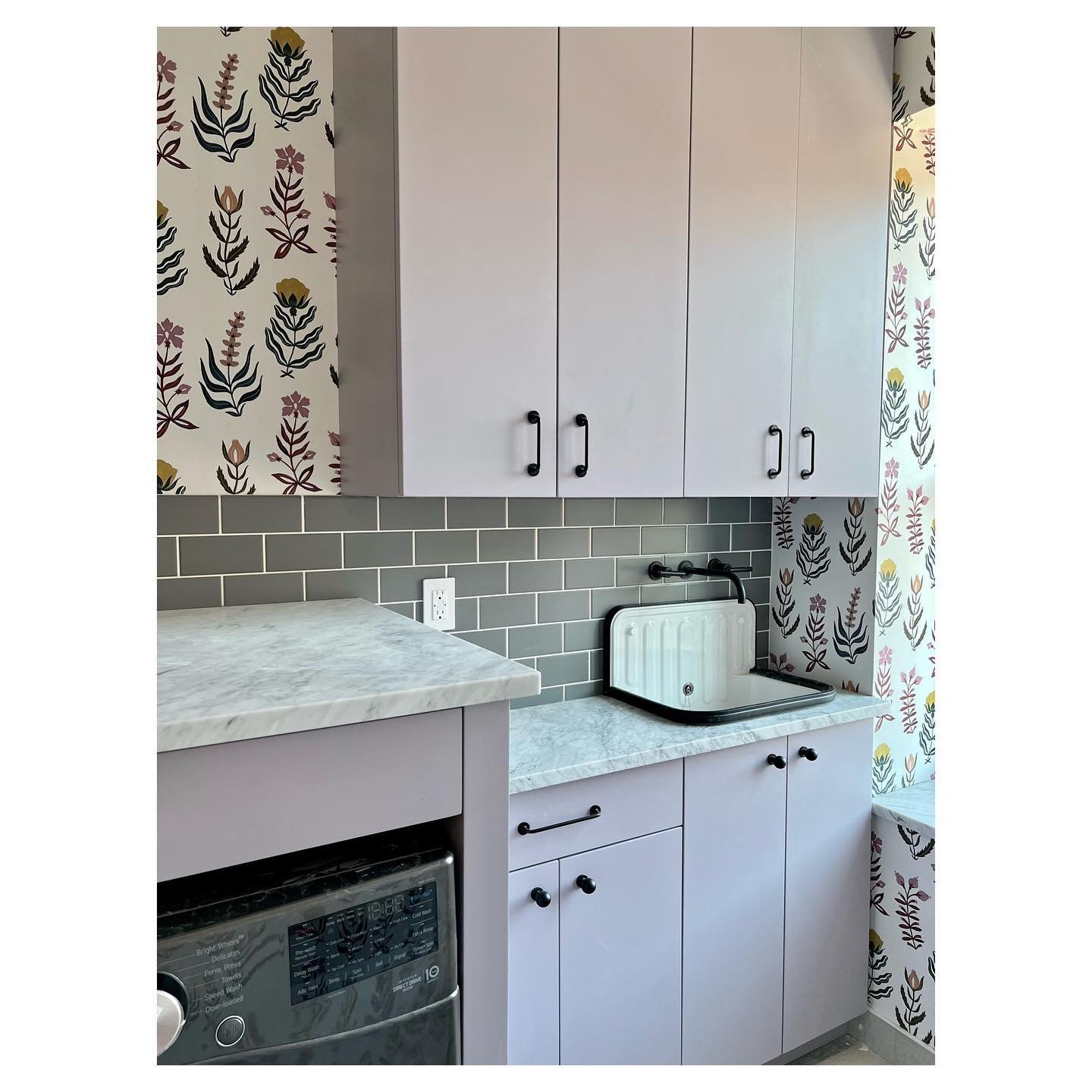
Kid’s Bathroom

Despite its modest square footage, this bathroom makes a bold impact with pops of yellow against black and white. "We wanted to do the whole thing yellow but thought it might be too much," says Fuer. Instead, she covered the vanity in Benjamin Moore's simply (and aptly) named Yellow and painted the closet door frame to match. Hidden behind its doors are a pull-out laundry bin and a medicine cabinet.
"It’s a small bathroom and there isn’t a lot of storage, so we fit a lot on that one wall," explains Fuer. As with the entire home, it's a solution that's practical, uncomplicated, and decidedly fun.
Living Room

In the living area, Fuer added a wall of built-in bookshelves that's both practical and eye-catching option. “In their old apartment they had a separate living room and another room with bookcases,” the designer explains.
In incorporating the shelves into the main living room, the designer wanted to ensure that the room felt “elevated and collected”—rather than, well, crowded. To achieve this, she turned to one of the client's favorite possessions: "They have a huge book collection,” says Fuer. By spreading their favorite volumes across a wall of shelves, "We infused their personality into the space.”
To delineate the living area from the adjacent dining space, Fuer gave it a cozy feel by layering a selection of rugs, many of which the family had picked up on their travels.
Primary Bedroom

The bedroom furniture has a significant backstory: The husband and his father built the bed and nightstand, and the wife's parents gifted them the sconces. "She said she wanted to use them in here and I was excited," says Fuer. The powder blue frames add extra dimension to the wave-print wallpaper from A Street Prints, while an assortment of pillows bring color and texture.
Son’s Bedroom

Radiators all along the perimeter of the son’s room presented an issue—both aesthetic and spatial—for outfitting the space. So Fuer had a millworker devise custom red covers, which connect to a red bookcase tucked between the room’s two windows.
Follow House Beautiful on Instagram. Hadley Keller is a writer and editor based in New York, covering design, interiors, and culture.